We came up with this idea to compare our storyboard to our final trailer. This will help when we evaluate our trailer, so we can see how our original developed over time. It was interesting to compare our initial ideas to the trailer after a long time.

Wednesday, 19 December 2012
Storyboard comparison
We came up with this idea to compare our storyboard to our final trailer. This will help when we evaluate our trailer, so we can see how our original developed over time. It was interesting to compare our initial ideas to the trailer after a long time.
Tuesday, 18 December 2012
Magazine Development and Final
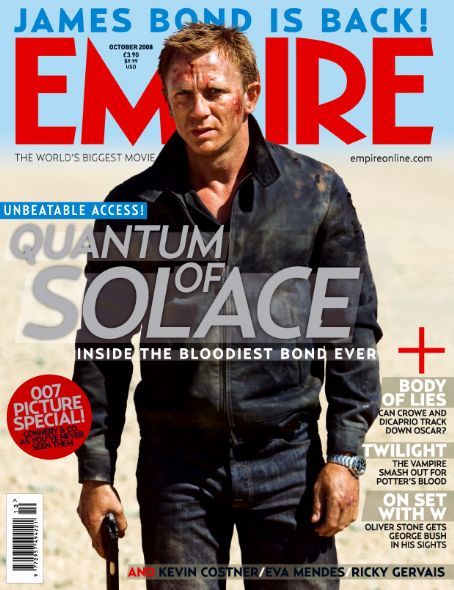
After researching magazine covers from Empire and Total Film, it was time to create our magazine cover.
We started with the pictures that we had taken for our poster, and decided to use different ones from last time. This was the one we went with, after cutting out the background.

We decided to use a similar effect as the poster, with Luke in the foreground and Max in the background and more transparent. We gave both an outer glow, Luke's was white to show that he was the good character in the film, and Max's was black to suggest that he would be a villain.

We originally went with the working title, HYDC Magazine, but we were advised that it might be weird that our production company was the same as our magazine.

We gave the title a black stroke and put the word magazine into HYDC.
We decided to change the name to Focus, originally because the featured film would be 'focused' on, but we also realised that focus could also apply to filming techniques such as focus pulls, so it is ambiguous.

We also put a texture on the gradient and gave the title a cyan outer glow instead.
The next step was to add the name of the film, which we did with the same style as the masthead. We also added a tagline and a 'world exclusive' stamp.

We also noticed that some of our magazine influences had other articles on the front, so we added a small sample on the right hand side of the cover and at the bottom, as well as a banner along the top which shows another article.

This is our final magazine.

Thursday, 13 December 2012
Tuesday, 11 December 2012
Magazine Research
We have been looking at Magazine covers from Empire and Total Film to get some inspiration for our own magazine cover, we believe we will make a Total Film magazine cover, mainly because we prefer the title and the type of cover they make.
Here are some examples of posters we want to replicate;


Tuesday, 4 December 2012
Poster Development and Final
Before we had our pictures, we decided to make a template. This consisted of the actor's names and the title itself.

For the background, we gave a simple gradient - grey to black. We gave the title some motion blur in the background to add depth. Also, the production logos were added in the bottom left hand corner.

We also added a small gradient under the actor's names so they could contrast more and stand out.
These are some of our pictures we managed to take.


Once we had uploaded our pictures, it was time to crop them.


We used the magnetic lasso tool which was effective because there was high contrast between the clothes and the background. Before we put them in the poster, we auto adjusted the tone, contrast and colour so the image would look more flat.
First, we decided to frame Luke and adjust the cropping which was needed in places. We did Luke first because he is the main subject of the poster.

Our idea to frame him like this is based off of several of our influences; Quantum of Solace and Die Another Die.
Once we added Max, we decided that he needed to be transparent, so his image was very subtle in the background, we also placed his picture on the layer below Luke's.

This transparency works well, as initial attention is drawn towards Luke, then Max. We also used another gradient to blend him into the background, so it was more smooth.
After a few more image adjustments and croppings, we decided it was time to add a quote on the poster.

We used white with a white outer glow to highlight the quote and place emphasis on it. At this stage, we also adjusted the title and added outer glows to both Luke and Max.
This is the final version of our poster, with some changes made based on the feedback we received.

We added a tagline just above the title, which is in a different text so it is clear that it is not part of the title of the film. We also added the skyline of London in the background for two reasons; so the background had more texture and depth, but to also reveal the location of the film - which we filmed in Elephant & Castle.
Overall, we are both happy with the poster and believe that we took features from our influences and applied them well to our film. We both believe that it reflects the theme well.

Subscribe to:
Posts (Atom)